
19 July 2026
Designing Dark Websites That Don't Look Muddy
The short answer
Dark websites look muddy when they use pure black backgrounds, pure white text, and grey-on-grey elements with no contrast hierarchy. The fix: use a very dark neutral rather than #000 as the base, build three or four elevation steps with progressively lighter surfaces, drop body text to roughly 85-90% white, and add one saturated accent used sparingly. Shadows barely read on dark UIs, so separate layers with borders and lighter surfaces instead.
Dark design is not inverted light design. Flip a light palette and you get exactly the muddy result: harsh text, invisible cards, and a page that reads as one undifferentiated slab. Rich dark sites are built on a different system.
Build an elevation scale, not one background
Pick a near-black base with a hint of hue, something like a deep warm charcoal or blue-black, then create three or four surface steps, each a few percent lighter. Page background at the bottom, cards one step up, hovers and popovers above that. On dark UIs, lighter means closer, and this scale does the separating work that shadows do on white.
Text and contrast rules
- Pure white on near-black vibrates; drop body text to 85-90% opacity white and reserve full white for headings.
- Keep body text comfortably above WCAG's 4.5:1 contrast ratio; muted greys fail faster than you expect on dark.
- Desaturate large colored areas slightly; saturated colors glow harder against dark and tire the eye.
- Use hairline borders at low-opacity white to define edges where shadows cannot.
Dark backgrounds make color expensive in the best way: a single ember-orange or electric-blue accent on CTAs and key moments carries the whole page. The Ember Studio template is built exactly on this system, dark elevation steps plus one hot accent, and the design modules of Premium Website Masterclass cover constructing dark palettes from scratch, including the contrast math. Test the palette on a cheap monitor at low brightness too, because elevation steps that read clearly on a bright display often collapse into a single tone elsewhere.
Put this into practice
All products →The tools and templates behind this guide — instant download, yours forever.
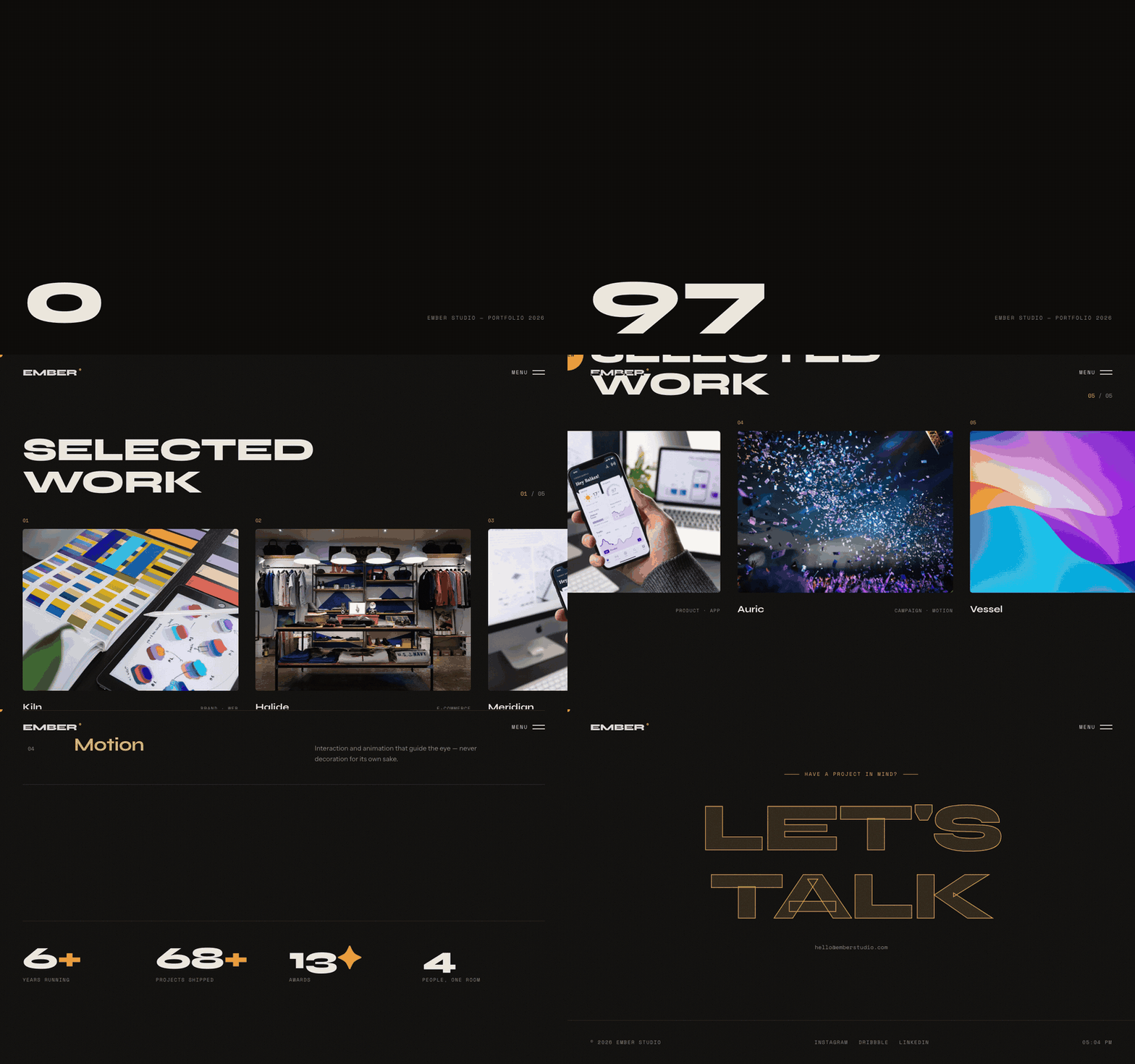 Template
Ember — Studio Portfolio Template
A dark studio portfolio that moves like a showreel.
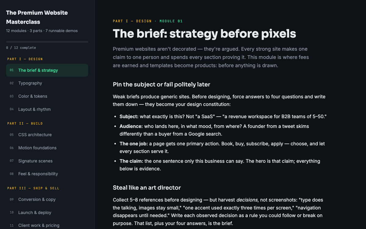 Guide
GuideThe Premium Website Masterclass
Design, build, animate, and sell premium websites — 12 modules, 3 parts, 7 runnable demos.
 Ebook
EbookThe AI Automation Playbook
Automate your business without code — workflows, AI steps, and real agents.