
19 July 2026
How to Build HTML Email That Renders Everywhere
The short answer
HTML email renders reliably when you build with tables for layout, inline all your CSS, and keep the design to a single column under 600 pixels wide. Email clients strip modern CSS and ignore flexbox and grid, so techniques that work on the web fail in Outlook and Gmail. Use web-safe fonts with fallbacks, add alt text to every image, and always test across clients before sending. Rules from the 2000s still win in the inbox.
Why does HTML email break so easily?
Email clients are not browsers. Outlook renders with Word's engine, Gmail strips your style tags, and each app supports a different slice of CSS. So the modern web toolkit, flexbox, grid, external stylesheets, quietly falls apart in the inbox. The reliable approach is deliberately old-fashioned: table-based layout, inline styles on every element, and no dependence on scripts or fancy CSS. A tested email template pack gives you layouts already built this way, so you skip rediscovering each quirk the hard way.
What rules make email render everywhere?
- Use nested tables for layout, not div, flexbox, or grid
- Inline every CSS style directly on the element
- Keep width at 600 pixels or less, single column is safest
- Use web-safe fonts with clear fallback stacks
- Add alt text to images, many clients block them by default
- Do not rely on background images alone; set a fallback colour
- Make tap targets large enough for thumbs on mobile
How should you test before sending?
Never send to a full list on faith. Send test messages to real accounts across Gmail, Outlook, and Apple Mail on both desktop and phone, and check that images blocked still leaves a readable email. Verify links, confirm the preheader text reads well, and view it with images off. Getting comfortable with the underlying HTML and CSS pays off well beyond email; the premium website masterclass builds the front-end fundamentals that make debugging both email and web layouts far quicker.
The constraints feel dated, but they are what keeps your message intact from Outlook 2016 to the latest iPhone. Build to the lowest common denominator and your email looks right for everyone.
Put this into practice
All products →The tools and templates behind this guide — instant download, yours forever.
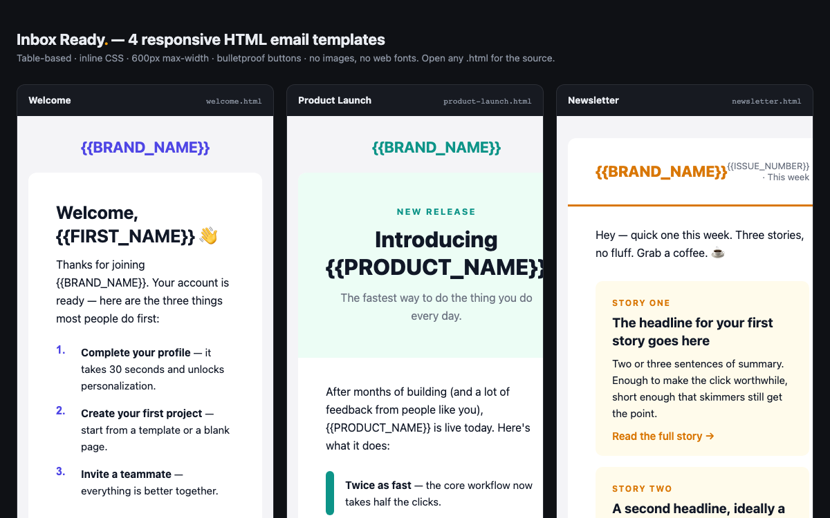 Template
Email Template Pack — 4 Bulletproof Emails
Four HTML emails that render everywhere — Gmail, Outlook, Apple Mail, mobile.
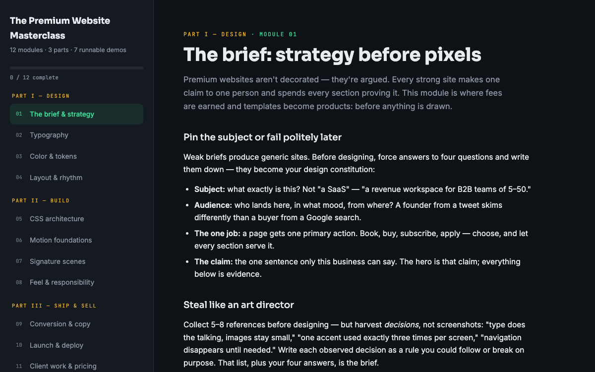 Guide
GuideThe Premium Website Masterclass
Design, build, animate, and sell premium websites — 12 modules, 3 parts, 7 runnable demos.
 Ebook
EbookThe AI Automation Playbook
Automate your business without code — workflows, AI steps, and real agents.