
19 July 2026
Mobile-First Design, Explained Practically
The short answer
Mobile-first design means designing and building the phone layout first, then expanding to larger screens — the opposite of shrinking a desktop design down. Practically: write base CSS for a single-column mobile layout, add complexity with min-width media queries, keep tap targets at least 44px, body text at 16px minimum, and test on a real phone. It works because constraints force prioritisation: deciding what matters on a small screen improves the desktop version too.
For most sites in India, mobile is not a secondary screen — it is the majority of traffic. Mobile-first is not a philosophy debate; it is building for the device your visitors are actually holding, then treating the desktop as the enhancement.
What it means in code
Your base CSS — no media query — is the mobile layout: single column, stacked sections, generous tap targets. Then min-width queries add columns, side-by-side layouts and hover states as space allows. This is more than convention: the simple layout is the default that every device can render, and complexity is opt-in for screens that can afford it. Shrinking a desktop grid down with max-width queries produces the cramped, pinch-zoom sites everyone hates.
The mobile-first checklist
- Tap targets at least 44px — buttons and links a thumb can hit
- Body text 16px minimum; below that, browsers may zoom your forms
- One column by default; grids arrive via min-width queries
- Hover is desktop-only — every interaction needs a tap equivalent
- Phone numbers as tel: links, addresses as map links
- Test on a real phone over mobile data, not just a resized browser window
No — it means the desktop experience is additive. Scroll animations, cursor effects and multi-column editorial layouts can all layer on top of a solid mobile base; GSAP's matchMedia even lets you run richer animation timelines only on larger screens. The templates here are built exactly this way — the Braise restaurant template collapses to a fast thumb-friendly column on phones while running fuller animations on desktop, as does the Grain photographer template with its galleries. Study either file and you are reading a working mobile-first reference.
Put this into practice
All products →The tools and templates behind this guide — instant download, yours forever.
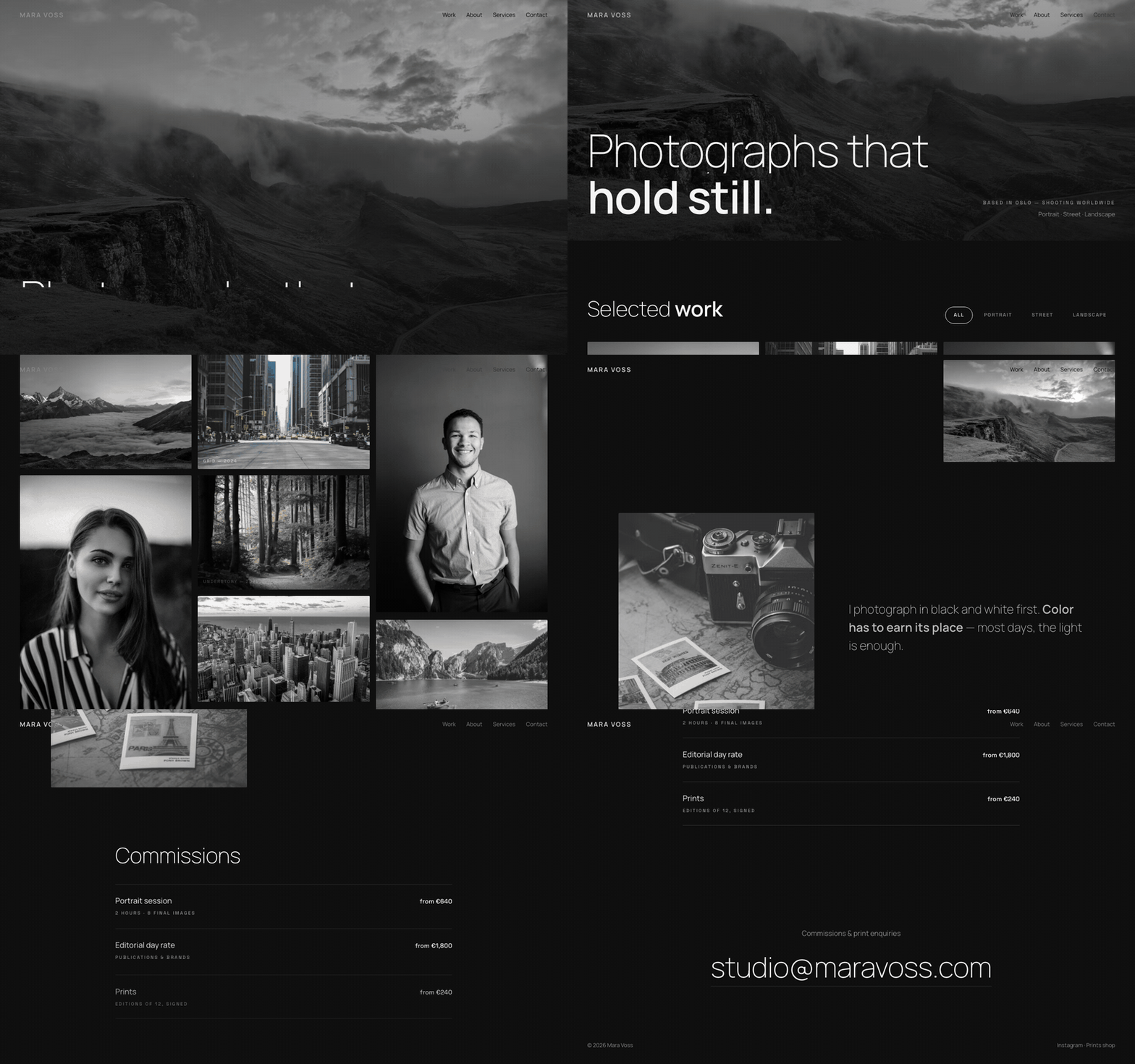 Template
Grain — Photographer Portfolio Template
A photographer portfolio with a keyboard-navigable lightbox.
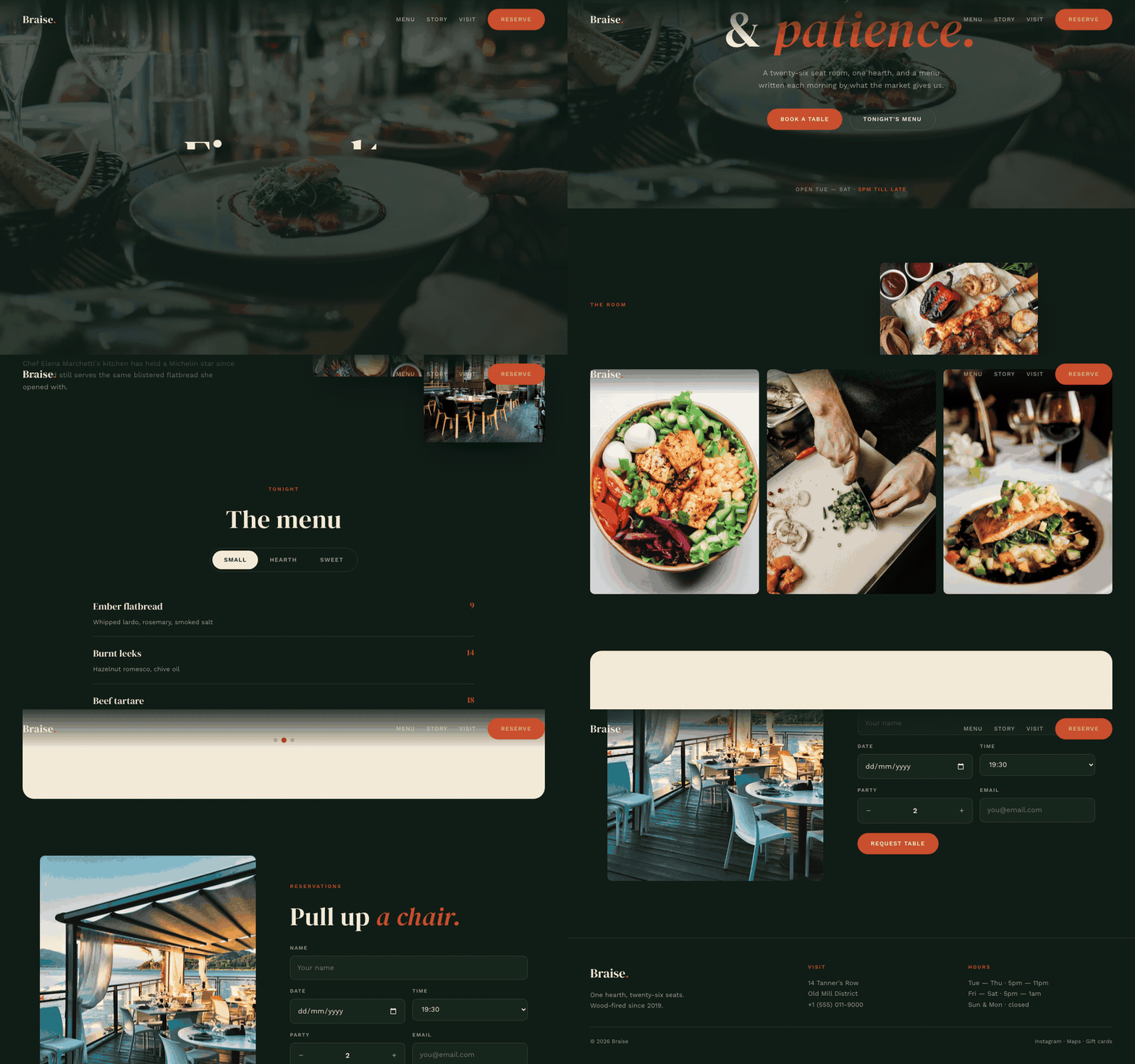 Template
Braise — Restaurant Template
A restaurant site that makes the menu feel like the food.
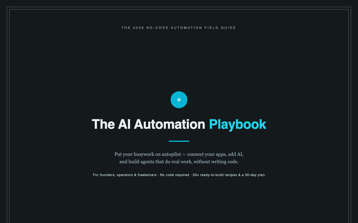 Ebook
EbookThe AI Automation Playbook
Automate your business without code — workflows, AI steps, and real agents.