
19 July 2026
Parallax Done Right (and How Sites Get It Wrong)
The short answer
Parallax means layers moving at different speeds during scroll, creating depth. Done right, it is subtle: background elements drift 10-30% relative to scroll, driven by a scrubbed ScrollTrigger animating yPercent, transforms only. Done wrong, it is fast-moving foreground text, images that shift layout, or motion that keeps running for users with prefers-reduced-motion enabled. A reliable test: if visitors consciously notice the parallax, it is probably too strong.
Parallax has survived every web design trend cycle because, at low intensity, it mimics how depth works in the real world: things farther away appear to move less. The failures happen when it stops being depth and starts being decoration.
The right way to build it
Use a scrubbed ScrollTrigger tween so the movement is bound to scroll position and reverses naturally: animate yPercent on the background layer from around -10 to 10 across the section's scroll range. Animate transforms only, never top or background-position, so the browser skips layout and paint. A common variant puts an oversized image inside an overflow-hidden frame and drifts it, so no edges ever show.
Where parallax goes wrong
- Too much travel: content flying past at different speeds reads as chaos, not depth.
- Parallaxing text: copy that moves while you read it is hostile.
- No reduced-motion fallback: vestibular-triggering motion should be removed under prefers-reduced-motion via gsap.matchMedia.
- JavaScript-driven position changes on scroll events instead of scrubbed transforms, which stutters.
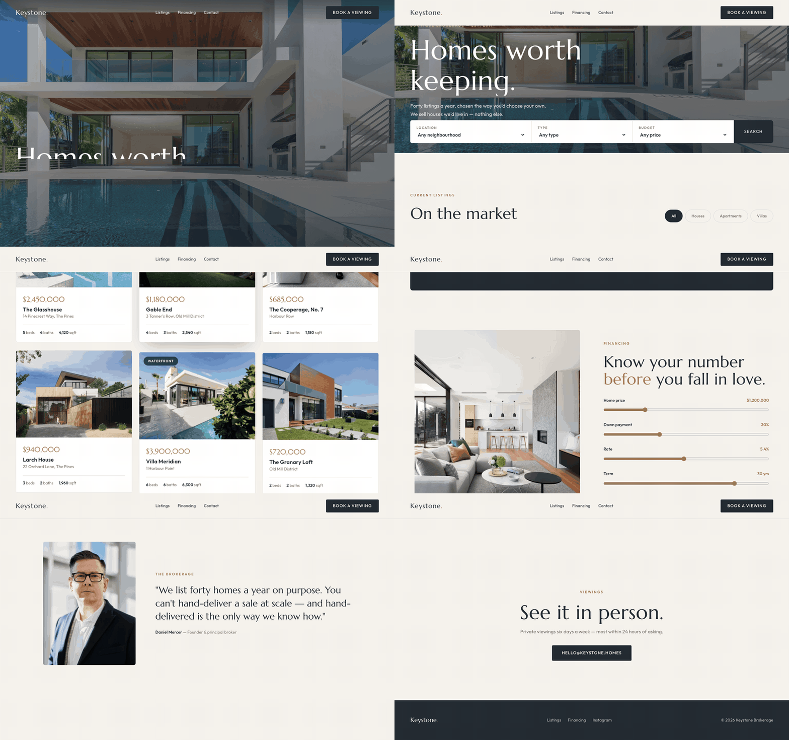
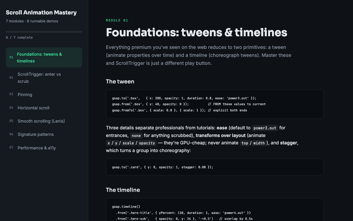
The hero and gallery sections of the Keystone real estate template use restrained image parallax you can inspect directly, since the whole template is one readable HTML file. If you want to understand why those numbers were chosen and build your own, the parallax module in Scroll Animation Mastery covers depth ratios, overflow framing, and the reduced-motion setup in detail. As a starting point, keep total parallax travel under about ten percent of the section height and increase it only if the effect disappears entirely. When in doubt, halve the movement and look again; subtlety is the entire point of the effect.
Put this into practice
All products →The tools and templates behind this guide — instant download, yours forever.
 Template
Keystone — Real Estate Template
A brokerage site with working filters and a real mortgage calculator.
 Guide
GuideScroll Animation Mastery
GSAP, ScrollTrigger, and Lenis — the five patterns behind every expensive-looking site.
 Ebook
EbookThe AI Automation Playbook
Automate your business without code — workflows, AI steps, and real agents.